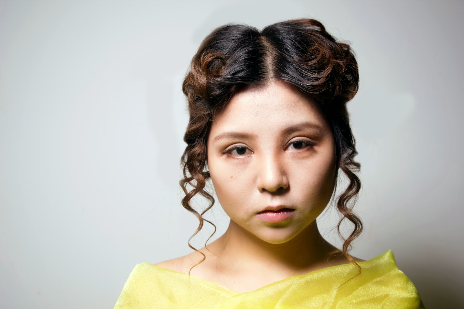
This is the outcome of that shoot.
In the previous blogposts I showed my makeup and hair inspirations and intentions.
However, I had to tweak both my hair and makeup designs a little.
You can see in the photos above that the top of the head has less volume unlike my original design, however, I thought this was appropriate as it takes away more of the softness in the hair. I also forgot that the model had a fringe, therefore, I had to adjust the hair to incorporate it. I used a small curling iron to curl the fringe upwards to create a curtain effect and secured it with lots of hairspray.
Here is the back of the hair, you can see that it is pretty much the same as my initial idea and I love how the waves at the front merge into curls at the back and the reflection of light in this photo.
You can see in the image above that the hair does flare up and is a little wispy around the face. I could've avoided this with more uniform curls and hairspray.
Onto the makeup, I decided to keep the makeup very natural. I mainly focused on contouring and enhanced the eyes with shadow in the crease and corners and a pair of very natural false lashes. In my face chart that I created for Estella, the skin around the eyes had pink and red shades, however, pastel and light reds do not show up very well in black and white and as a result I decided to add contour to the eyes instead to add dimension.
Overall, very happy with the outcome.


No comments:
Post a Comment